On flat design
The flat is the new black. You've probably noticed that the flat is the most trendy thing in the mobile and web design topic these days (however, the true hipster may tell you that it's too mainstream, so he has moved to something drastically new). Pushing the content, promoting the simple visual choices and borrowing the inspiration from the good old Swiss design may sound so easy for a casual reader who doesn't think too much about it. The most striking example is what the people often say about Microsoft design experiments, namely Windows Phone and Windows 8. I've heard these “just remove gradients, shadows, and the rounded boarders, add some tiles – and you are good to go” ramblings so many times. Sometimes it makes me sad that the users confuse an abstract idea (design principles) with its specific implementation (design patterns, solutions or even controls).
Apple has pushed it even further with iOS7. Well, not actually Apple but the journalists, writers and users. They've built a simple mental model, associating the word “flat” with the recent Microsoft and Apple products, effectively destroying the original principles standing behind the flat design. This random article which popped up in my feed recently is a nice example – the author tells you that flat design may not be that great, because some basic principles are poorly implemented in iOS7 and Windows 8. Well, that's the problem with these specific products, it doesn't mean the flat design is flawed in general!
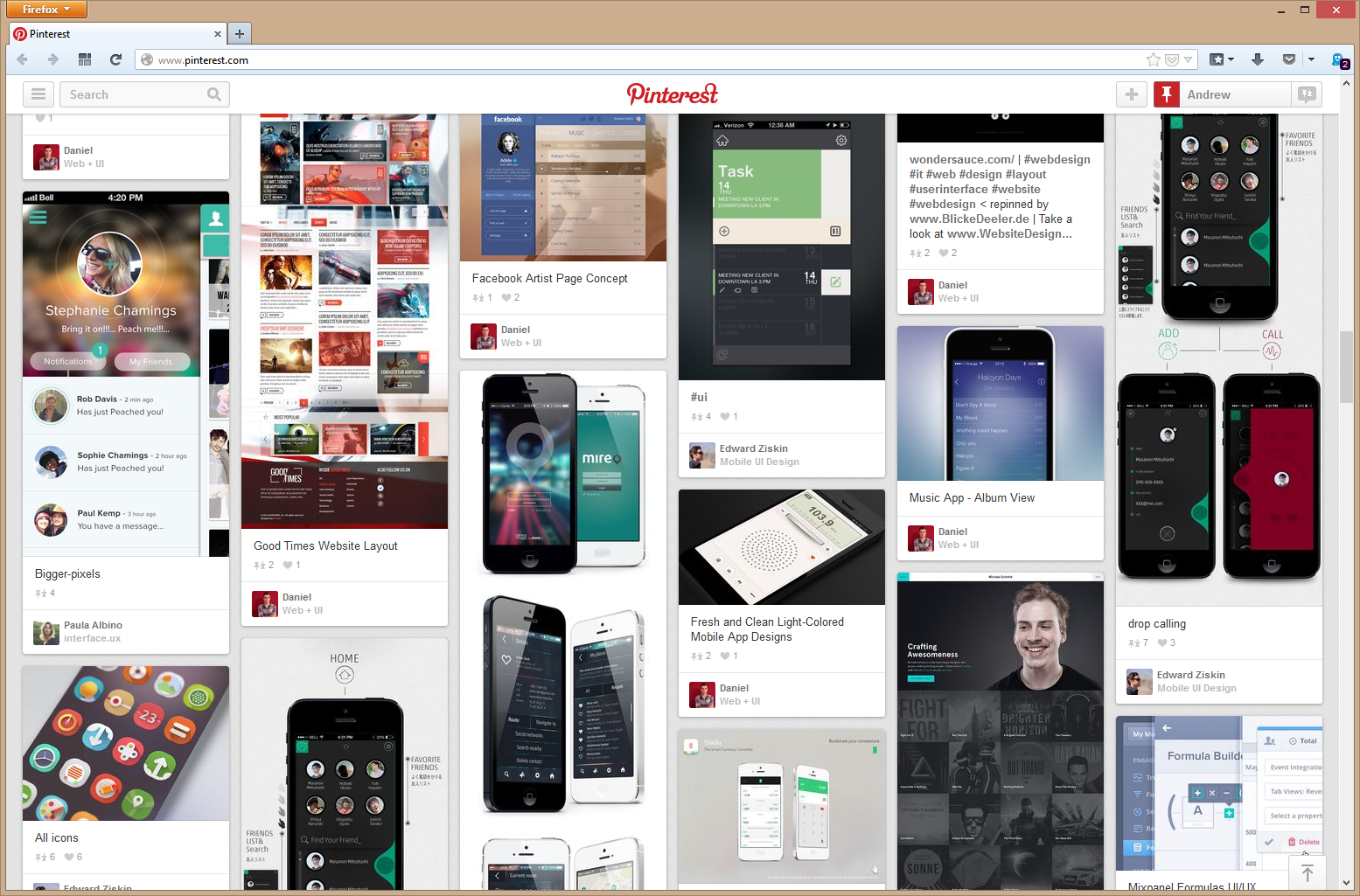
Some Pinterest boards on mobile and web design are the good examples of how great the flat may work and how easy it is to fail with unwise solutions trying to mimic it. On the side note – try to find any devices out there besides iPhone. Damn that marketing.
Microsoft community has recently realized that blindly following the platform guidelines gets in the way of the creativity. They have declared the guidelines as some basic patterns to get you up and running, so that you can quickly build the beautiful user-friendly app even if you don't have the proficient designers in your team. However, they don't discourage you from implementing your own great UX ideas and going beyond the basic controls and behaviors – just try to be nice and don't publish the crappy apps with inconsistent and irrational visual design.
